How to Use Color the Right Way in Your UI Designs
UX designers have a lot to consider when choosing and applying colors to UI designs. But it’s not as hard as you think, and by applying good design practices you'll ensure high-quality results.
As promised, I’m getting back to nuts-and-bolts design for this week’s newsletter, and we’re going way back to basics by talking about color. I know that you design nerds already learned more about color in your second year at uni than you probably ever needed to. But first, this isn’t a color class; and second, not everyone is a design nerd. Also, there are some nuances to using color effectively in UI designs that are easy to overlook.
But first, if you’re not a subscriber then you should be! I won’t spam you, and members get access to exclusive content posted a few times per month.
OK, so back to using color.
As noted above, this article is not intended to be a course in color theory or application, and I'm not going to spend (much) time attempting to delve into cultural connotations and so on.
Applying the Brand
Almost all UX designers are either working for a company or working for an agency that’s working for a company. And all companies have some sort of brand system that probably includes colors. Most brand systems include a primary color and a couple of secondary colors, some neutrals and a few accents. Or you might be unlucky and have every color possible. But either way, the brand has colors and it’s your job to figure out how to apply them effectively to a product interface.
Taming a brand color system and making it work for a coherent UI can be a challenge, but here are a few tips to get started.
First, pick out any colors that don’t meet Web Content Accessibility Guidelines (WCAG) contrast standards (more on that later). Right away you know that you can use those for backgrounds or certain accents but not for buttons, text, or icons.
Then do some experiments to see how you can pull in your brand colors and make them work together. This may take some time, but remember that you’re trying to convey the brand through the user interface, so you can look to other company materials, including print pieces. The brand and marketing teams are your friends, so check in with them for advice and feedback.
Be bold where you can get away with it. Gradients are back and can pack a lot of visual punch when used correctly. Be careful, though; while using super bright, multicolor gradients can bring visual interest and power to your design, you should avoid the bland skeuomorphic look of yesteryear. (Hubspot says skeuomorphism is “controversial.” They are wrong – it sucks.)
You may see articles posted on the internet about using the golden ratio to apply color, which results in applying your primary, secondary, and neutral colors in something like a 10:30:60 ratio. Forget about that – it’s utter nonsense. There is no magical ratio and if you try to calculate your color usage ratios you’re insane and/or have too much time on your hands.
Dark Mode is a PITA
Dark mode is all the rage these days, and lots of people use it. But designing a dark-mode UI isn’t as simple as just making the background dark and the text light. You need to evaluate how your iconography, buttons, and accents work on a dark background. I won’t discourage you from designing a dark version of your product, but keep in mind that it can entail quite a bit of work and significant additions or updates to your design system. Even Apple sometimes gets it wrong.
Avoid Problematic Connotations
I know I said that I wasn’t going down this path, but there are some obvious things to be aware of when designing a product UI. Certain colors are associated with specific states or actions. For example, red often means danger or error and green is usually coded as success or good. So using red for your primary actions could be problematic because people might infer an error or danger state. They will figure it out, but you may increase cognitive load on the user. Also, how would you draw attention to an actual error state that requires user intervention?
I’m not saying you can’t use colors in new and fun ways, but it’s important for designers to consider whether that’s the best option. Remember that UX design is not art, and we don’t get to write our own briefs.
Accessibility
And now for the big one: accessibility. When designing UIs we have to ensure that our color choices produce sufficient contrast so that people can read content and understand actions. And we also need to account for folks with colorblindness.
Color Vision Deficiency (aka Colorblindness)
Color vision deficiency is much more common in men than women, affecting about eight percent of men in the United States. There are several different types of colorblindness, but they generally fall into three categories:
- The most common type makes it difficult to differentiate between red and green.
- Another type causes blue and yellow to appear similar.
- In rare cases, people have complete color vision deficiency, meaning they don’t perceive color at all.
Red-green colorblindness – called deuteranopia – is by far the most common, affecting more than five percent of the population. Sometimes people take this to mean that we can’t use red or green at all, but that’s not quite true. It does mean that designers need to carefully consider which colors to use; some tints and shades are easier to perceive than others.
But most important, we need to not rely on color alone to convey meaning. Per WCAG Success Criterion 1.4.1: “Color is not used as the only visual means of conveying information, indicating an action, prompting a response, or distinguishing a visual element.”
Let’s look at an example:
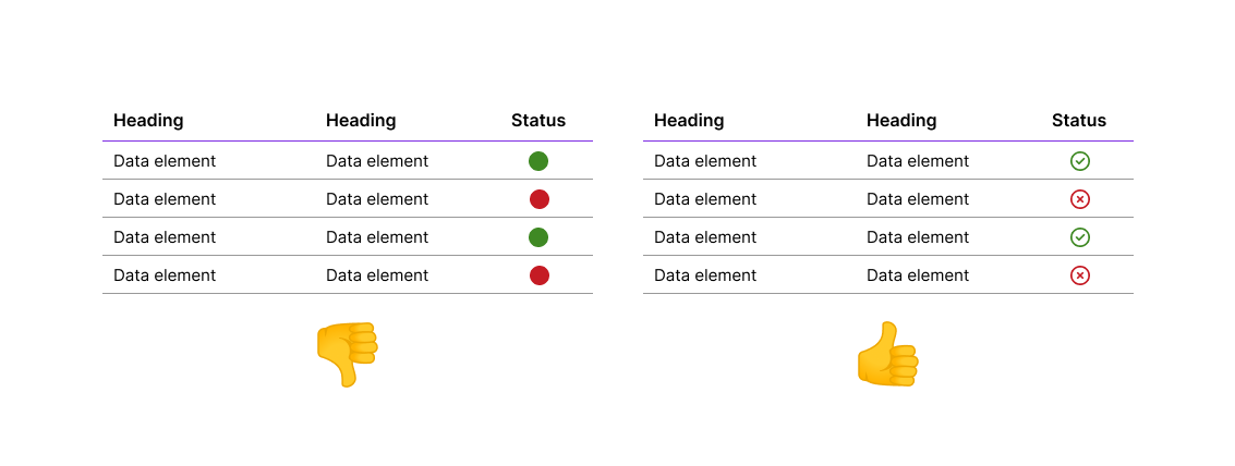
The left table doesn't work because we're relying on color alone to convey the status. The right table works better because the icons convey the status even if colors are not visible. The problem becomes obvious when we process our tables through a colorblindness simulator:
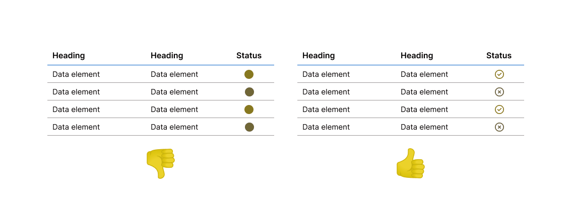
It’s important to test your colors using a colorblindness simulator when considering colors for your user interfaces. With the Coblis simulator you can upload an image and see how it appears to people with different types of colorblindness. Adobe Color also offers a tool to help you test your color choices.
Contrast, Contrast, Contrast
And this brings us to perhaps the most common, yet easy to fix, problem: contrast. WCAG 2.1 specifies that, “The visual presentation of text and images of text has a contrast ratio of at least 4.5:1.” There are some exceptions, but 4.5:1 is a good target in all cases.
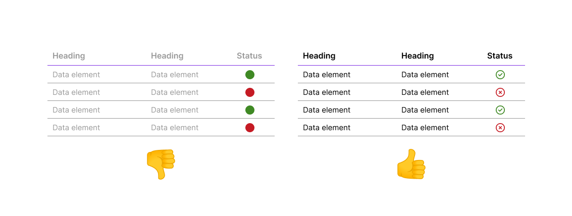
In this example, the table on the left uses a lighter color (#999999), which provides only a 2.85:1 contrast ratio. This falls short of the WCAG guideline of 4.5:1 and could be difficult to read.
It’s important to test your color choices to ensure that your design offers sufficient contrast between the foreground and background. This includes both text and icons. Fortunately, there is an abundance of tools for testing this. I prefer the WebAIM contrast checker, but Adobe Color includes one as well.
I most often run into contrast problems when trying to apply brand colors to UI designs. Brand kits are usually designed for a variety of media including print, television, and out-of-home (OOH). Oftentimes brand designers don't account for accessibility, or if they doWow, is it’s not a priority. So UI designers may end up having to adapt company palettes to work online.
As you can see, there is a lot to consider when choosing and applying colors to your UI designs. But it’s not as hard as you think – by performing a few simple checks and applying good visual design practices your user interfaces will look good and will be accessible for all.
The Roundup
Figma is Buying Dynaboard
Figma seems to be putting its billion-dollar Adobe windfall to work, having announced that it intends to acquire Dynaboard. I hadn’t heard of Dynaboard, but it’s an “AI-supercharged,” low-code development tool that offers to connect with an impressive number of third-party tools and apps.
Following hot on the heels of the dev mode launch, this clearly signals that Figma has designs on being more than just a design company. I’m interested to see where this leads.
Design Challenges are B.S.

A (very long) two-part piece posted to UX Planet nicely debunks the practice of requiring designers to perform unpaid spec work as part of the hiring process. This is a good read for any designer, but doubly so for design leaders and hiring managers.
I’ve hired plenty of successful designers over the years and have yet to conduct a single design or whiteboard challenge. If a manager can’t figure out a candidate’s skills by reviewing their portfolio and discussing their work then perhaps that person should not be hiring people. And if for whatever reason you insist on wasting time on these pointless exercises, at least pay the designer for their time.
VHS-Themed Posters
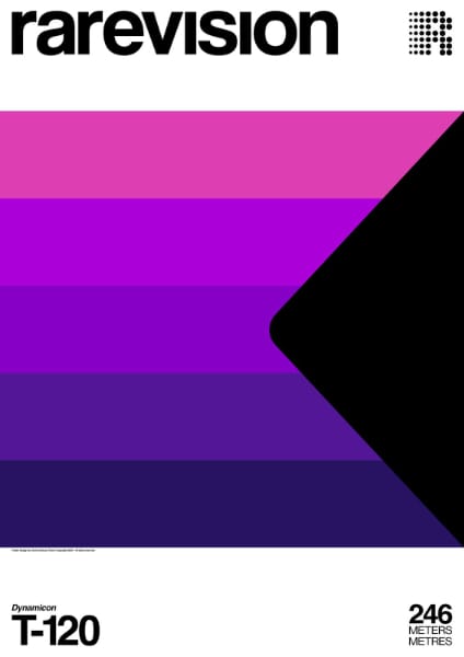
Do you miss the days of VHS? Yeah, me either, but I’ll admit that these posters are kinda nifty. Designed by Xavier Esclusa Trias, they definitely pack a punch and are incredibly true to the original designs. Sadly, they do not appear to be available for purchase.