How to Practice Ethical Design
Successful user experience designers are empathetic toward their users. Ethical research and design practices are a critical part of creating experiences that are inclusive, respect users’ wishes, and encourage healthy habits.

We made it to another Friday, which means that it must be time for another Design Flaw! In last week's issue I mentioned how ethical design practices can help ensure that products meet regulatory standards. This week I'm going to expand on what ethical design means and how it can help us build better products.
But first, if you’re not a subscriber then you should be! I won’t spam you, and members can post comments and receive additional, in-depth stories a few times per month.
This probably seems obvious, but user experience designers have quite a lot of influence over how products behave and how they affect the people who use them. That's pretty much literally our job, after all. So it stands to reason that one of our primary goals should be to design products that don't harm our users.
I realize that this can be difficult at times, given pressure from executives and product managers, but we should be able to find a balance between "our product needs to support the business" and "total, unhinged enshittification."
Ethical Research
This could be a post all to itself (and probably will be at some point), but I'll offer few quick tips here. First, be careful when writing research plans, screeners, and so on. Carefully define your target audience and be sure to account for any biases in your research.
It's also important to define terms for research participants. For example, if you're working on a research study involving AI, it's a good idea to clearly explain what you mean by "AI." Most people who use tech products aren't not necessarily tech savvy, so it's important that they understand what you mean.
Also, when conducting usability testing be sure that your test script is clear and that your prototype works the way it's supposed to. Limit the audience during testing - my rule is three people: the tester, the moderator, and a note-taker. That's all. No product managers, no bosses, no developers. And make sure the tester knows that they can bail out at any time, no questions asked.
Finally, be sure to anonymize data in your test report. Use generic terms such as "Tester 1" vs. names or titles. Recordings and notes should be kept confidential and destroyed as soon as practical.
Accessibility
I incessantly hammer on accessibility, and it's a key part of ethical design. More than 10 percent of Americans have some sort of disability; that increases to 16 percent globally, which accounts for 1.3 billion people. So designing accessible products is not just the ethical option, it also makes a lot of business sense.
It's not that difficult to meet WCAG 2.1 AA requirements. Sites with multimedia will need captioning for video, but that should be part of the video team's standard workflow. And yes, the developers and QA folks will have to do a little extra work, but the result is well worth it.
So understand how WCAG applies to your work and then apply it.
Privacy and Security
About three-fourths of Americans are concerned about their digital privacy, and data breaches seem to happen on a daily basis. While we're not developers or security engineers, designers can do our part to help keep our users safe.
When designing login flows, be sure to account for multi-factor authentication (MFA) flows. Also, keep in mind that not all MFA is created equal, and designers can advocate for more sophisticated security measures such as app-based MFA, biometrics, or passkeys.
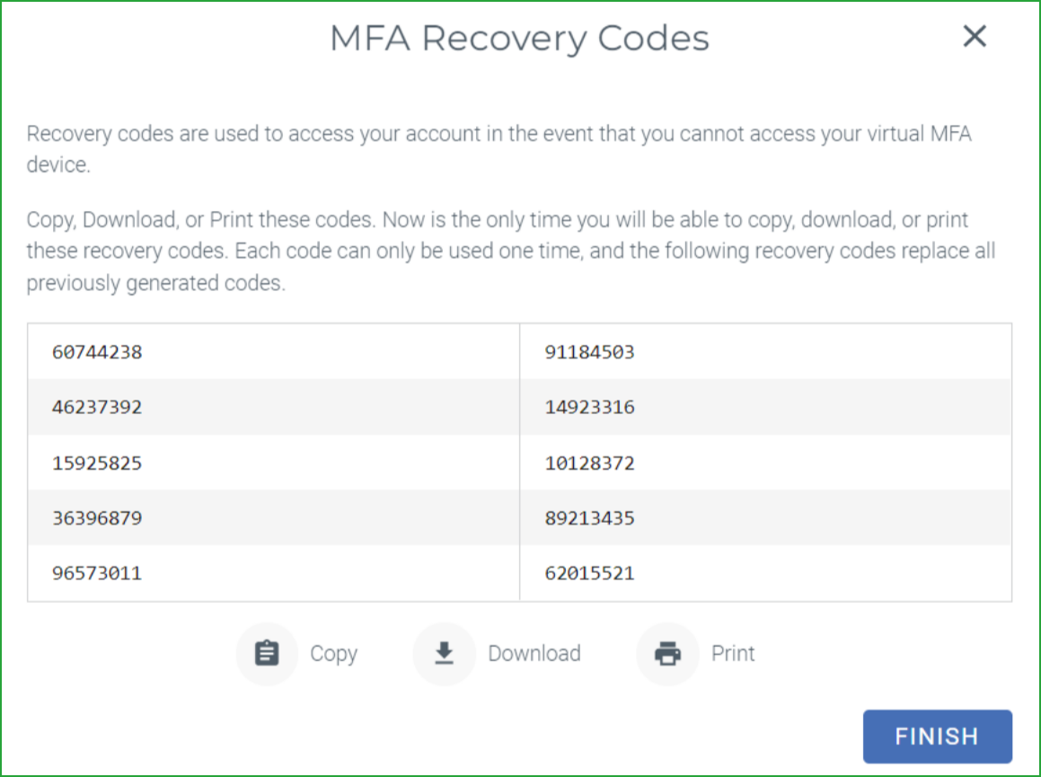
It's a good idea to add some fail-safe features to MFA configuration flows. For example, require users to confirm that they have printed or downloaded their recovery codes before completing the MFA setup process.
Also, you should use MFA every time you can. If you don't, start today.
Privacy Policy and Disclosures
Speaking of privacy, how about making privacy policies and data usage disclosures visible? I realize that we can't rewrite them to make sense, but at we designers can do our best to ensure that users can at least find the privacy policies. We should also do our best to clearly indicate how data is being collected and used.
It's our job to advocate for our users, so only collect information that you really need. I once had a product manager ask to collect 13 pieces of personal information - including home address - for a fast food loyalty app. I was aghast, partly because it was hugely invasive but also because no one is going to fill out that form (on a phone, no less) for 50 cents off a crappy UPF cheeseburger.
So in summary, be clear, succinct, and collect only what you need. Enough said.
No Dark Patterns
Dark patterns are everywhere and can be incredibly insidious. You've seen them: the auto-checked "Sign up for email updates" boxes in checkout flows, irreversible checkouts, random crap added to your cart, and even the annoying "confirmshaming" B.S. that marketers think is cute.
Play it straight with users and don't try to trick them into doing things they don't want to do. It's unethical and in some cases could be illegal. Deceptive Patterns has a lot of good detail on dark patterns, and FTC has weighed in, as well. If you find yourself being pressured into designing dark patterns then perhaps it's a sign to update your resume and start looking elsewhere. Just sayin'.
Promote Healthy Habits
Related to dark patterns, we should strive to design products that don't promote unhealthy habits. It's pretty well known that big tech companies have employed psychologists for the purpose of keeping users engaged with their products. While it's not entirely clear whether social media is truly addictive, I think we all know how easy it is to be sucked into an algorithmic feed for hours, whether you want to or not.
Don't design features intended to trap or trick users, and don't try to coerce users to behave in ways that may be harmful of against their best interests. I'm not a psychologist and this topic gets real complicated, real fast. But always remember that UX designers need to be empathetic toward our users. Pay attention to what you're working on and be careful about how you treat your users.
AI
Regular readers know by now that I'm highly skeptical of most current so-called AI implementations. The vast majority seem to lie somewhere between "pointless" and "actively harmful." And don't even get me started on Shrimp Jesus.
But that said, I think there are plenty of opportunities for AI that's actually useful. Earlier this week I subscribed to Copilot for Microsoft 365, which, as the name implies, integrates Microsoft's Copilot LLM directly into Office apps, including Outlook, Teams, Word, Excel, PowerPoint, and Loop. I've only just started using it, but you can expect an in-depth look in an upcoming issue.
UX designers should be looking for ways to integrate AI into products in ways that actually make sense for users. Research is important here - if we understand our users and their pain points then we can look for ways to solve them. Well-implemented AI could be one way of improving user experiences.
What I'm saying here is that we we should be more like Copilot (even if it might possibly have an evil alter ego) and less like Shrimp Jesus.
The End
Always remember that as UX practitioners we have a responsibility toward our users. It's important that we treat our users with respect and build products that actually make things better for them. You'll feel good, they'll feel good, and the world will be a slightly better place as a result.